Astor Park Photo Shop Poster:
 For this poster I took several images from Astor park and pasted them into photo shop, I used the liquify tool on the main image of the park and messed with the bus, the street lamps, the wall and the church. I also placed a random planet in there to give it a strange twisted look. Next I took parts of the graffiti on the wall and warped them too fit at the bottom of the image along with the Astor park sign, this gives the viewers a close up on the graffiti and the name of the park.
Photoshop tree pattern:
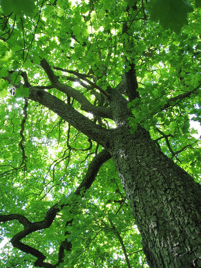 For this i took an image of a tree from Google and opened it up in Photoshop i changed the hue/saturation and made it purple, I then took the letter S and used the font Harrington. I enlarged the S to fit the whole image, put the opacity down and cropped the parts the S couldn't reach. i then flattened the layers and moved them into a new file. I then duplicated the layer and flipped the copy horizontally, i then flattened the layers again and duplicated it again but this time i flipped the image vertically.
Photoshop Texture rubbing:

 For this I took a piece of paper and found a cabinet in college, I placed the paper on the cabinet and used a graphite pencil to get the texture i then took a photo of it and put it on my memory stick, i then opened it up in Photoshop and changed the hue/saturation to make it green, I then made a text layer with the letter A in the old English text font, i rotated it to the right and free transformed it to fit the image, cropping the image in places where the letter couldn't reach, I lowered the opacity on the text layer and flattened the background and text layer together. I then moved the image into a new file and duplicated the layer, flipped the image horizontally and flattened the layers, I then duplicated the layer again and flipped the image vertically.
 Photoshop roses pattern:
I took an image of roses from Google and pasted it into Photoshop,
 i then changed the hue/saturation to make it a nice dark blue, next i made a text layer with the letter L and changed the font to Vivaldi, I then free transformed it to fit the image, cropping the image in places
where the letter couldn't reach, I lowered the opacity on the text layer
and flattened the background and text layer together. I then moved the
image into a new file and duplicated the layer, flipped the image
horizontally and flattened the layers, I then duplicated the layer again
and flipped the image vertically
i then changed the hue/saturation to make it a nice dark blue, next i made a text layer with the letter L and changed the font to Vivaldi, I then free transformed it to fit the image, cropping the image in places
where the letter couldn't reach, I lowered the opacity on the text layer
and flattened the background and text layer together. I then moved the
image into a new file and duplicated the layer, flipped the image
horizontally and flattened the layers, I then duplicated the layer again
and flipped the image verticallyMind Map research for final piece:

Graffiti Tags:

 The tags on the right are just the rough sketches i drew up, my final design is the one on the left. As you can see the base design for my final piece is the tag on the lower right i just changed the A and added some colour.
Typography Experimentation:
For this i took a picture of myself to use as a base, i then used the filter Chalk and Charcoal to make it black and white.


Texture Rubbings:


Kaboom magazine storyboard:

Blue Tack Stop motion:
This is the stop motion animation we did as a group using blue tack, we all made a blue tack character and took pictures, but only one person in our group really did any editing to it in photoshop.
Materials, Techniques
and Processes - Evaluation.
For my final
piece I used photoshop, I drew a stickman and made him run across the screen to
light some dynamite that was attached to some C4, the C4 would then explode and
the word Kaboom would appear along with some examples of other pieces of my
work, The explosion would then disappear along with the word Kaboom and the
examples of my work, then the words Innovation and Tradition in Art and Design
appear and stay for a while until they dissipate.
Learning
Outcome 1:
I think my
final project could have been better if I had had more time to develop my idea
and to create it, for example I wasn’t very pleased with the way the explosion
turned out with more time I may have been able to find a way to blend it
better, also I was going to have the words innovation and tradition and art and
design be blown away as if they were made of ash but I lacked the time to even
find out how to do something like that let alone actually do it.
Learning
Outcome 2:
I decided to
draw a stickman for my final piece because I think it shows tradition in art
and design, though it may be simple the first kind of drawings made were on the
same level as a stickman drawing and I thought it would bring an interesting
contrast to the rest of my final piece animation which is solely photoshop, I
also decided to use Clouds difference in photoshop to create an explosion
rather than take an image from the internet to show that I have some knowledge
of photoshop.
Learning
Outcome 3:
As I pointed
out before I feel that I didn’t have enough time to properly develop my idea, I
also felt quite pressured to get at least one idea so when I thought of it I
didn’t consider thinking up any other ideas I just wanted to get my work done
and out of the way with the time I had left. The only problem that I
encountered whilst I was creating my animation was that when I created the C4
with the dynamite sticking out of it, any changes I made to that layer, for
example having the fuse on the dynamite get shorter as it burns, would change
in the all of the other layers, so when the stickman first runs in the fuse
would be on fire and getting shorter, I fixed this by duplicating the layer
with the C4 on it and changing them individually.
Materials, Techniques
and Processes – Evaluation (Will Roberts) http://unit2willroberts.blogspot.com/
Learning
Outcome 1:
I think Will
should have used photoshop for this rather than flash because I have seen him
use photoshop and he’s very good at it, he would have been able to showcase a
lot of his skills on photoshop, possibly affecting his grade. Although he did
his animation on flash it’s still good, it’s only six seconds long and very
simple, but I think it adequately depicts our criteria, he also added sound
directly into flash which is in time with the animation. Other than what I said
about him doing it in photoshop I don’t think he could have made it any better,
unless he made it longer or did something with the text at the end.
Learning
Outcome 2:
Will has
used a motion tween for the bomb at the start of the animation, he then onion
skins the explosion and the text Kaboom is just placed in the frame, and lastly
he tweens the text Innovation and Tradition in Art and Design.
Learning
Outcome 3:
I assume
Will only had this idea, because he didn’t blog any others. I don’t think he
developed the idea very much because his animation is short and simple, and
because it’s so simple I don’t think he would have encountered any problems or
issues that would take very long to fix.


